
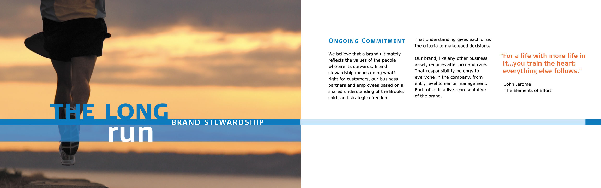
Brooks Sports–Dedicated to the Run
For a time I was Creative Director for Brooks Sports. My small team of designers and I were tasked with creating a new direction for the brand. One that put more of a serious spin on the Run Happy message. Brooks was floundering in the market at the time and needed to find itself again. The product line became too big and started to dilute the performance aspect of the brand. They were becoming the "BBQ Shoe". The company decided to cut the product line a focus solely on the run. Emphasizing on the technology that creates the feeling of running happy.
Old vs. New
The logo seemed stagnant for the message we were trying to convey as a brand. So we italicized the name and adjust the chevron size relationship to the name to give the logo some speed.
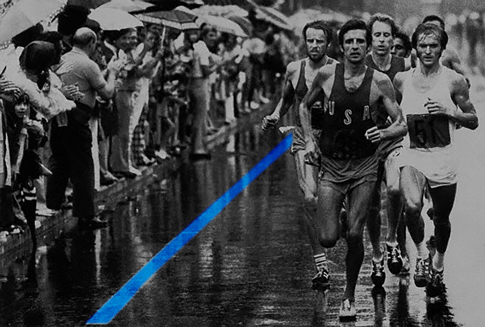
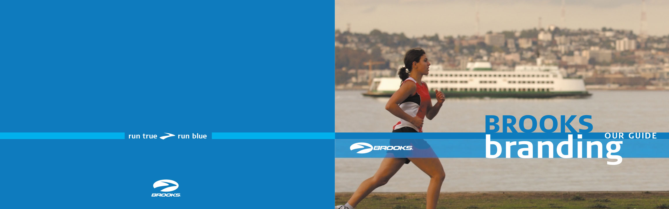
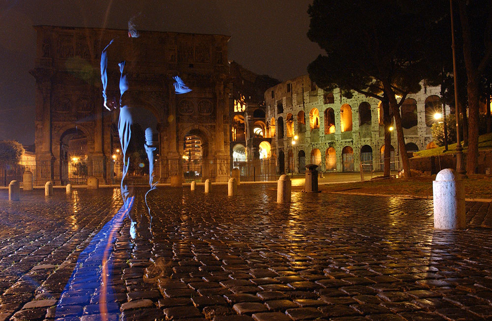
Run True, Run Blue
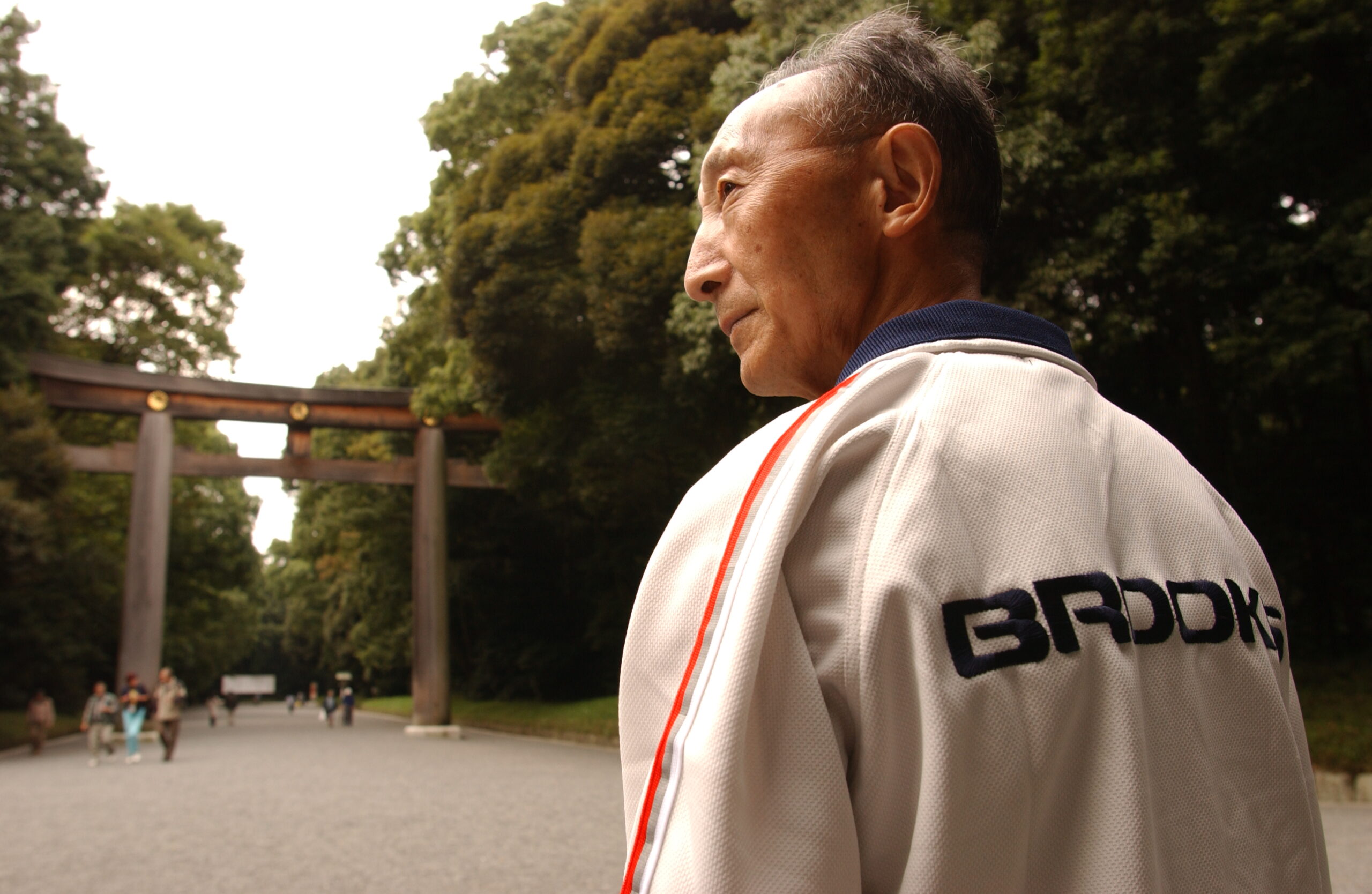
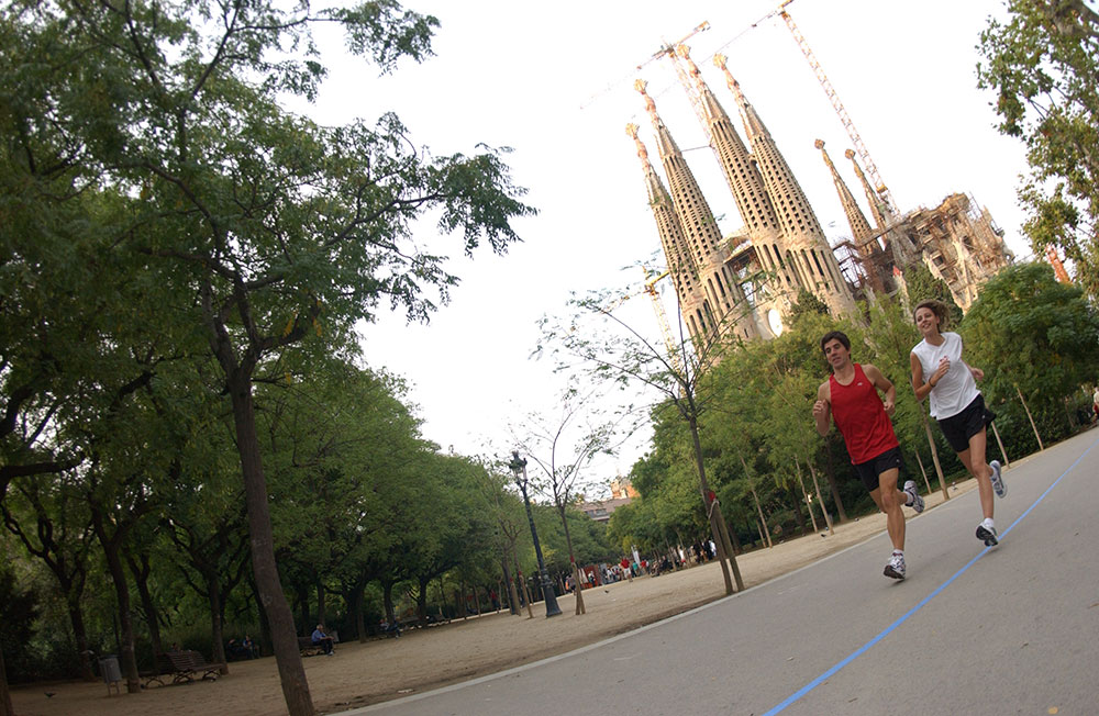
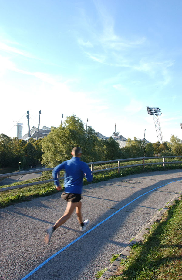
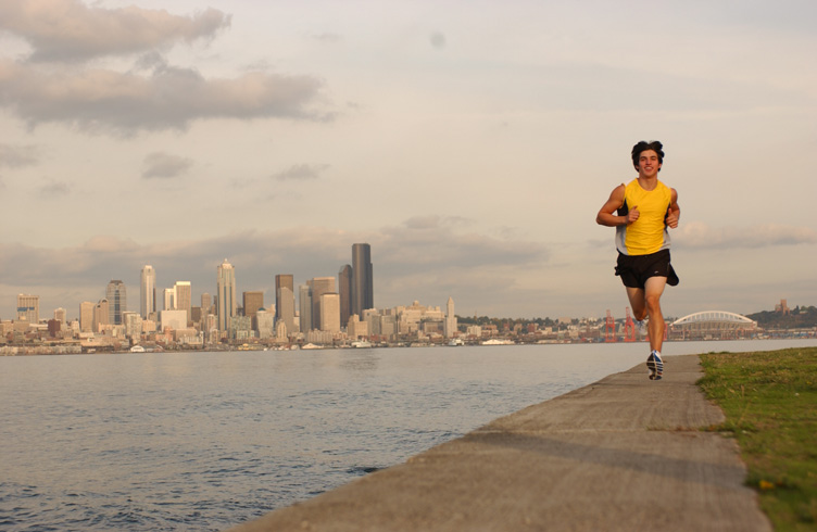
We were entering an Olympic year. The marathon is the ultimate challenge for any runner and we wanted to symbolically attach our brand to the blue line that marks the route of the Olympic marathon.
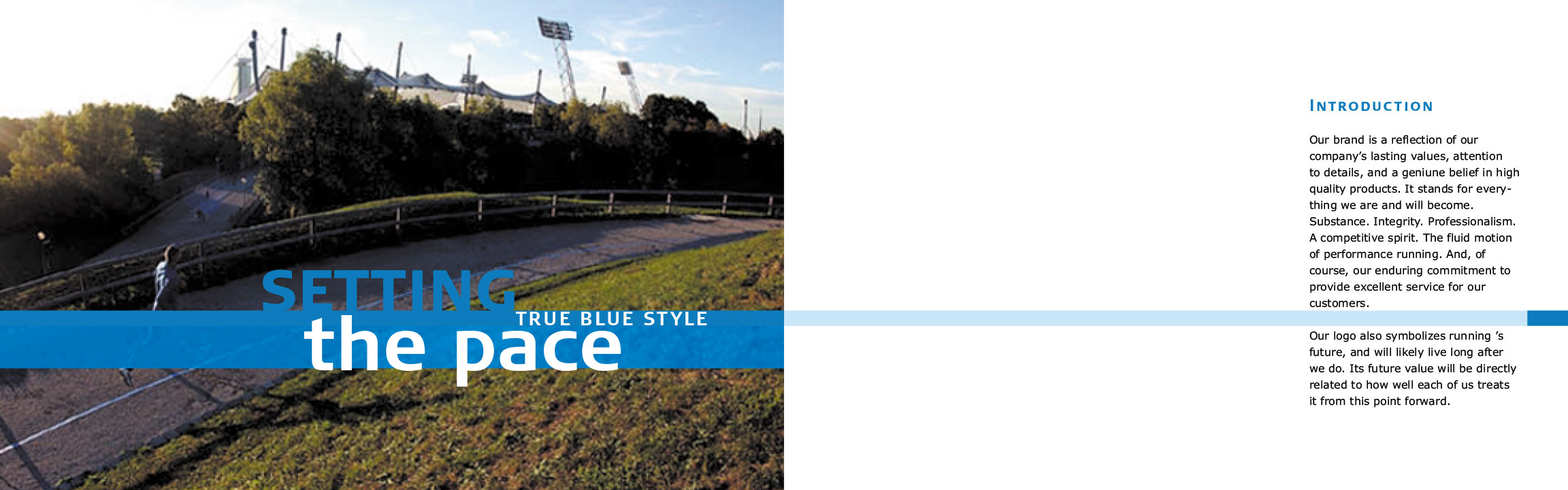
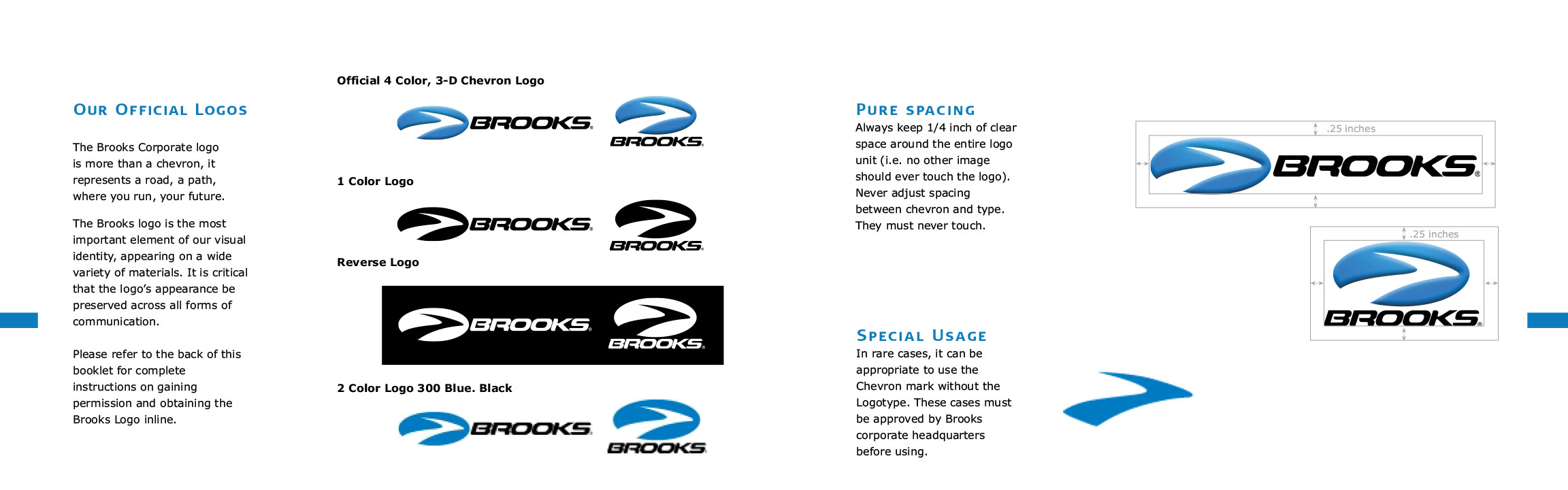
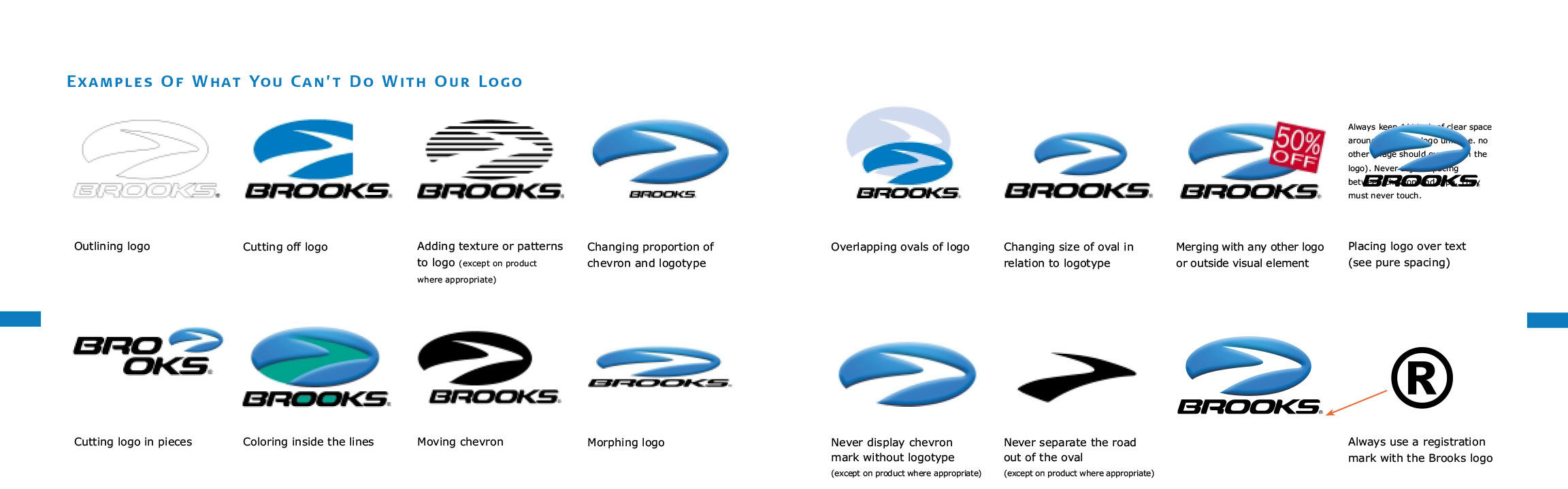
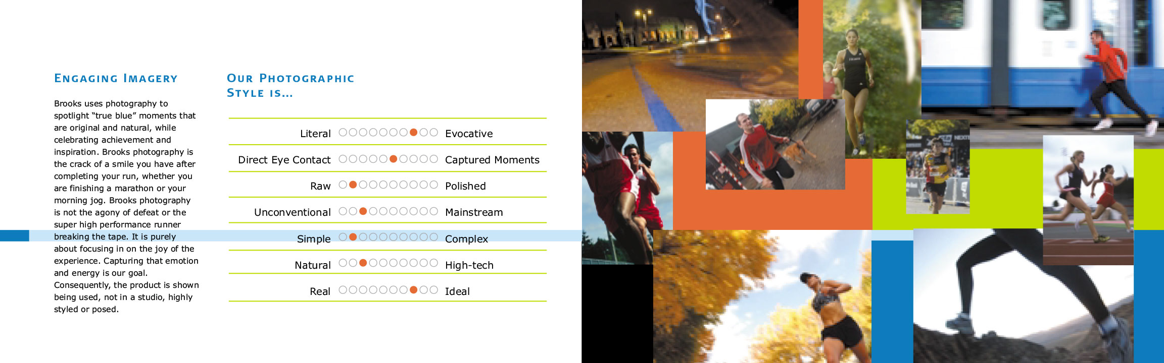
A New Style Guide Was Developed to Communicate the New Branding
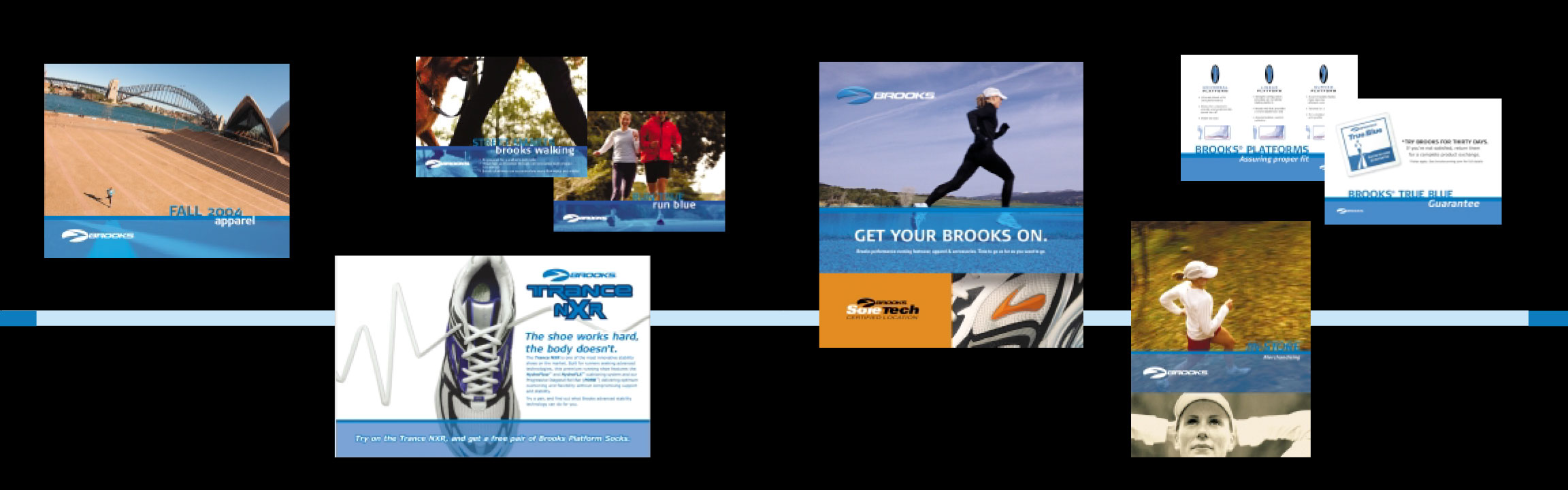
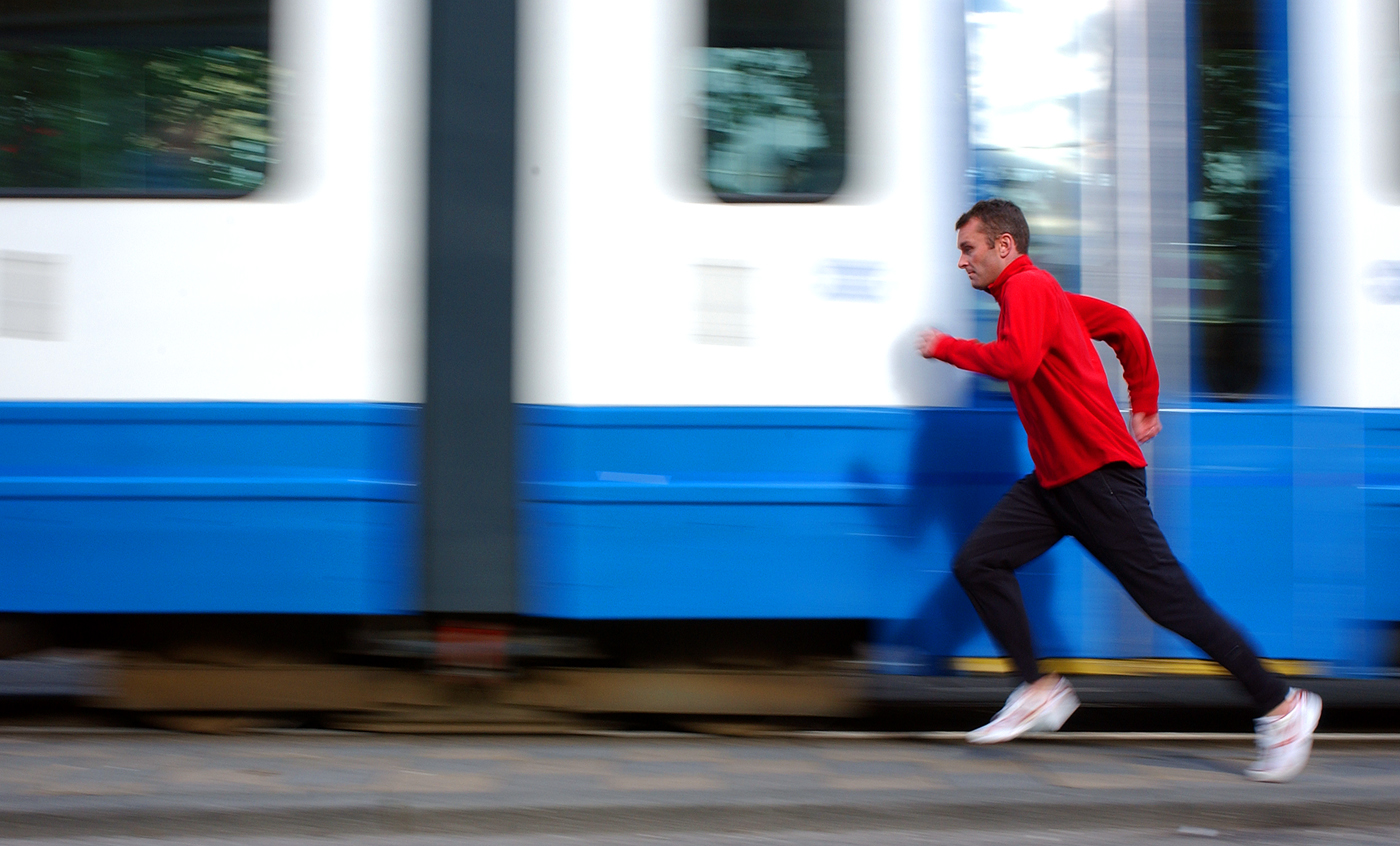
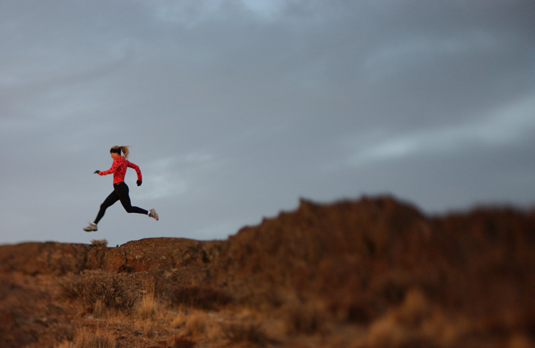
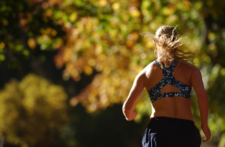
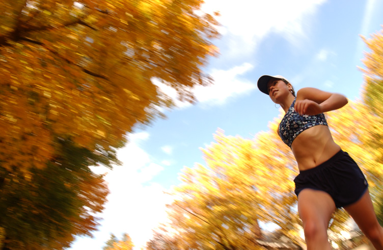
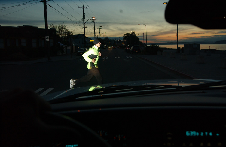
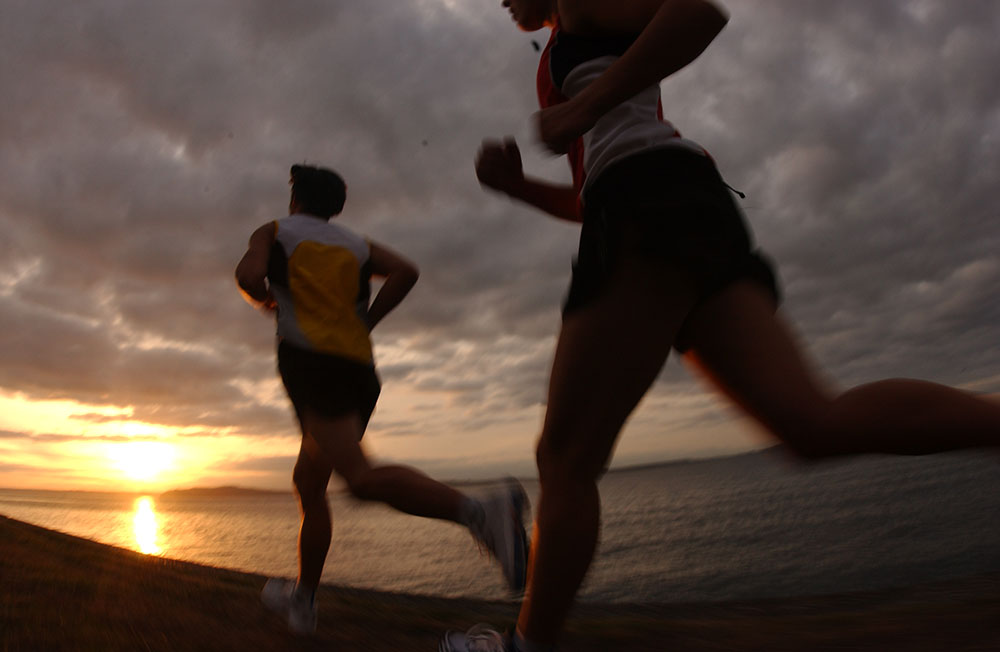
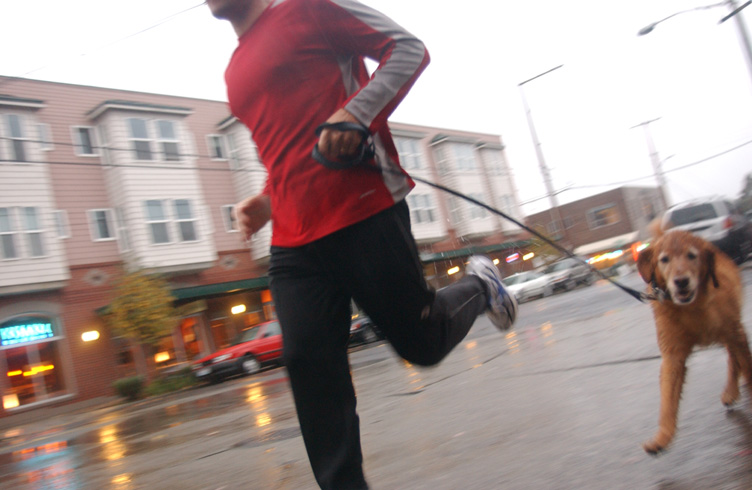
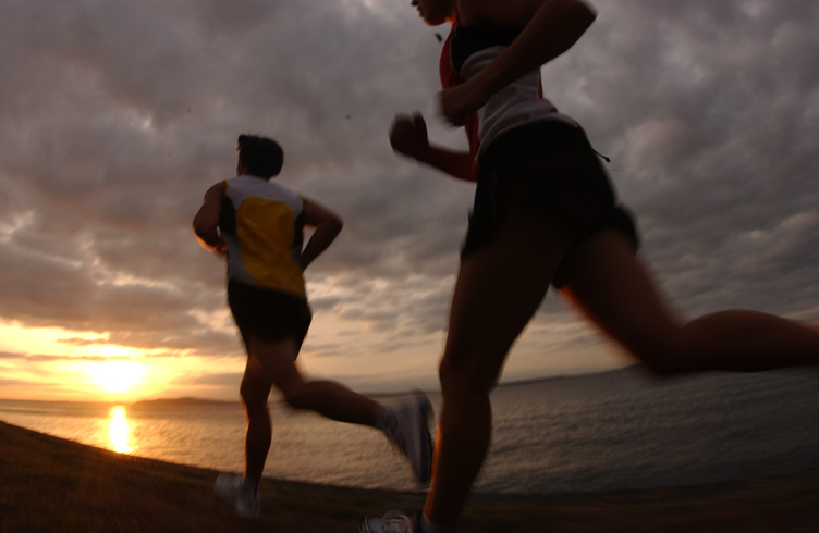
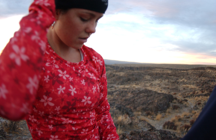
Photography That Tells the Blue Line Story
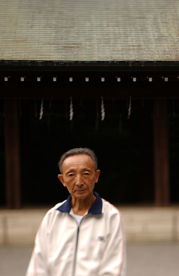
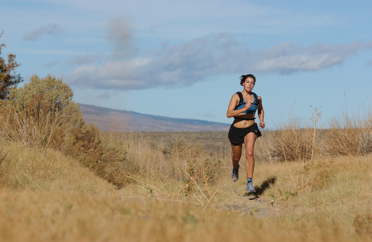
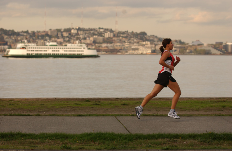
I teamed up with world-renowned photographer Chase Jarvis to capture the essence of the Brooks Blue Line. We traveled to Olympic host cities around the world, art directing, shooting video and photographing runners on each venue’s marathon blue line.


Brooks Brand Videos
Sales videos were created to capture and show how Brooks is synonymous with the blue line and it represents to a Brooks runner.
All our videos were produced in-house by myself and the creative team at Brooks.